Quick Navigation
- Introduction
- Track Training Load with CTL, TSS, TSB
- Longest Session by Sport Type
- Compare Power Duration Curves
- Populate the Race Report Feature
- Year-to-Year Sport Volume Breakdown
- Standardized Warm-Ups for HR Monitoring
- Efficiency Factor (EF)
- Athlete Feedback via Smiley Faces
- Track, Sleep, HRV, and Body Battery (Garmin)
- Automatically Apply Training Zones
- Conclusion
- Author Bio
TrainingPeaks Dashboard Setup Guide for Coaches
About 10-15 years ago when I started working with clients and athletes, one of my cyclists in Calgary tried to tell me that if I wasn’t using TrainingPeaks to do my endurance programming, I was likely missing out. I believe at the time the price tag was about $20/month which I just couldn’t justify! So – I sent off my excel spreadsheet program to this individual – and looking back – how useless that was for him! No integration with his power trainer, no integrated testing, difficulty following heart rate and power zone suggestions, and overall just clunky!
TrainingPeaks is one of the most valuable tech tools for endurance coaches and their athletes. With smart application, it extends far beyond just endurance – it’s been an integral part of my workflow for athletes in Ironman, 5k track, national team biathlon, and even non-endurance sports like bobsleigh and sprinting so that we can track away dates, plan strength days and sprinting days in a shared calendar, and so we can share feedback day to day and week to week on each workout (something an excel spreadsheet does not do well).
I’ve been using TrainingPeaks for over five years and have refined my dashboard setup through dozens of iterations. As a Canadian Certified Exercise Physiologist since 2012 with both a Bachelor’s and a Master’s of Kinesiology from the University of Calgary, I’ve built programs and analyzed data for Olympians, World Championship qualifiers, and elite-level team sport athletes. Whether you’re just getting started or are a seasoned coach looking to streamline your systems, this guide is something I wish I had when I first started using Training Peaks, and so I hope it will help you drive better decisions and save you time.
After reading, if you still need help, you can contact us or book a free 15-min consult call with me HERE.
Why a Smart Dashboard Matters
A well-organized dashboard offers a bird’s eye view of your athlete’s progress, workload, and patterns – without needing to dig through their entire training history. Here’s how I would suggest setting up key TrainingPeaks dashboard charts for maximum coaching impact:
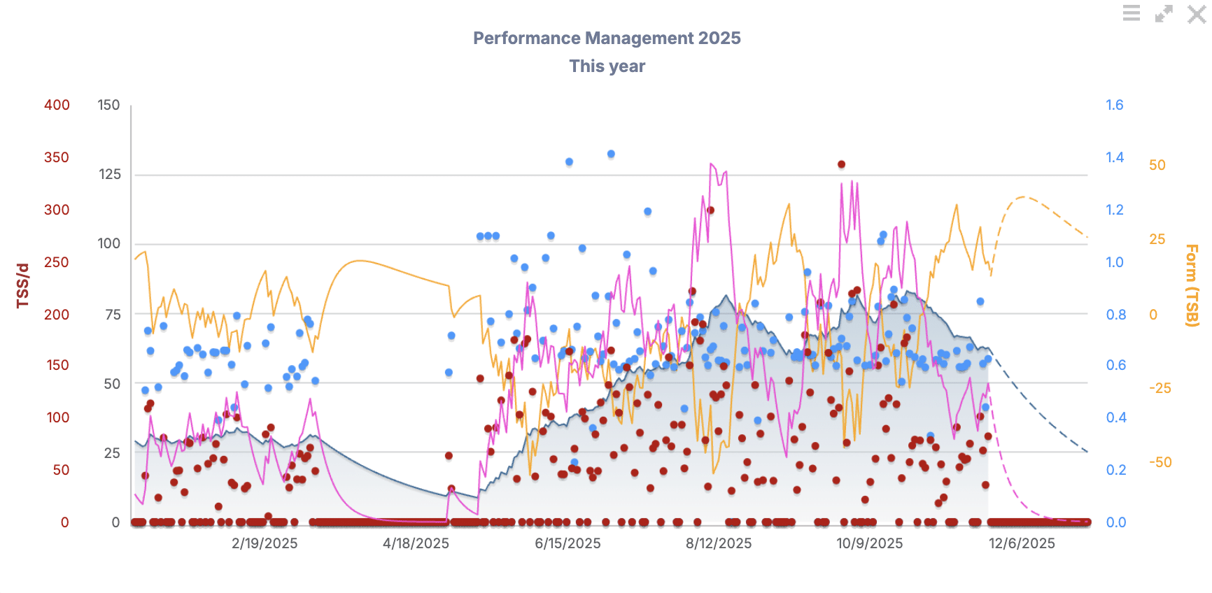
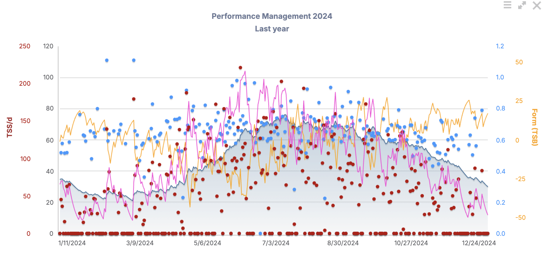
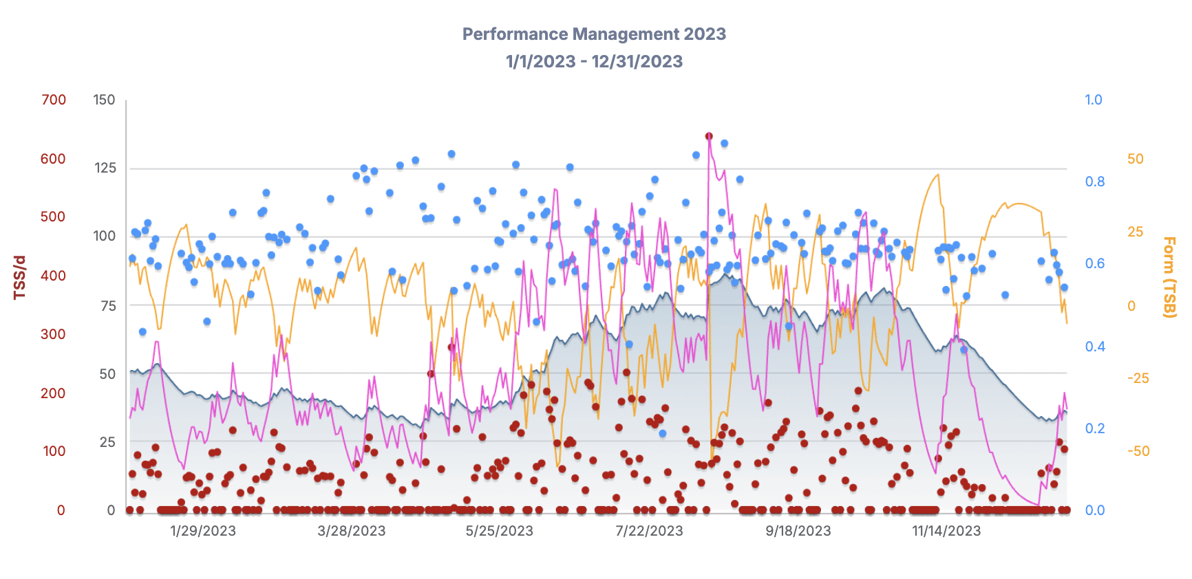
A. Track Training Load with CTL, TSS, and TSB
- View long-term trends in your athlete’s fitness using the Performance Management Chart (PMC). This chart helps you visualize:
- CTL (Chronic Training Load): long-term fitness trend
- TSB (Training Stress Balance): freshness/recovery (negative = more crushed; positive = more recovered)
- TSS (Training Stress Score): overall training load of a given session
- Use this Zoomed-out view on your athlete’s Dashboard to see if the athlete’s training is progressing, plateauing, or tapering – monthly or across the year.
- You’ll be able to see these metrics on a week-to-week basis as well, covered later in this article
- Keep in mind the navy shaded mountain-looking peaks and valleys shown on the charts below are an indication of overall fitness trend.
- I like to keep at least 3 consecutive years of Performance Management Charts back-to-back on the Dashboard of my athletes on Training Peaks.
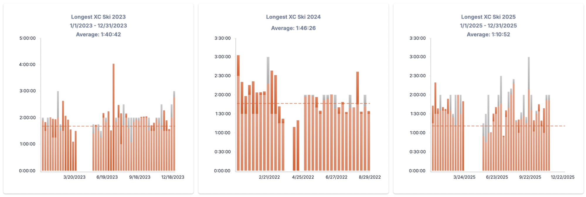
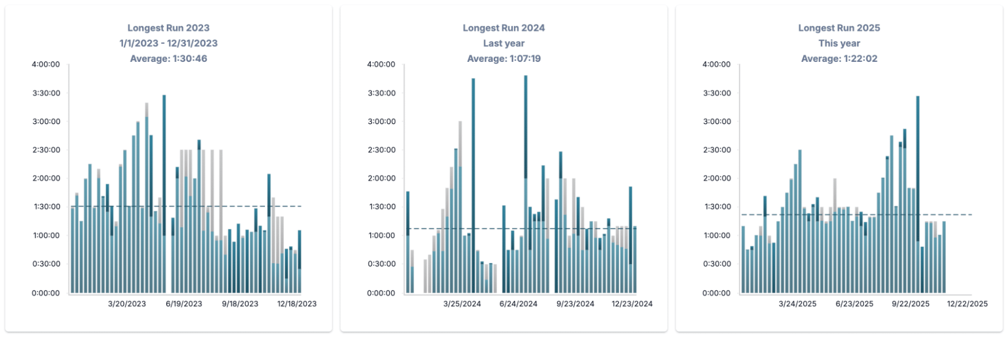
B. Longest Session by Sport Type
- Add charts on your Dashboard that track the longest ride, run, swim, or ski. This helps you:
- Set goals to exceed previous long sessions from previous years, or dial them back if goals have changed or training philosophy is different
- Plan peak endurance days when appropriate throughout the year.
- See progression over years.
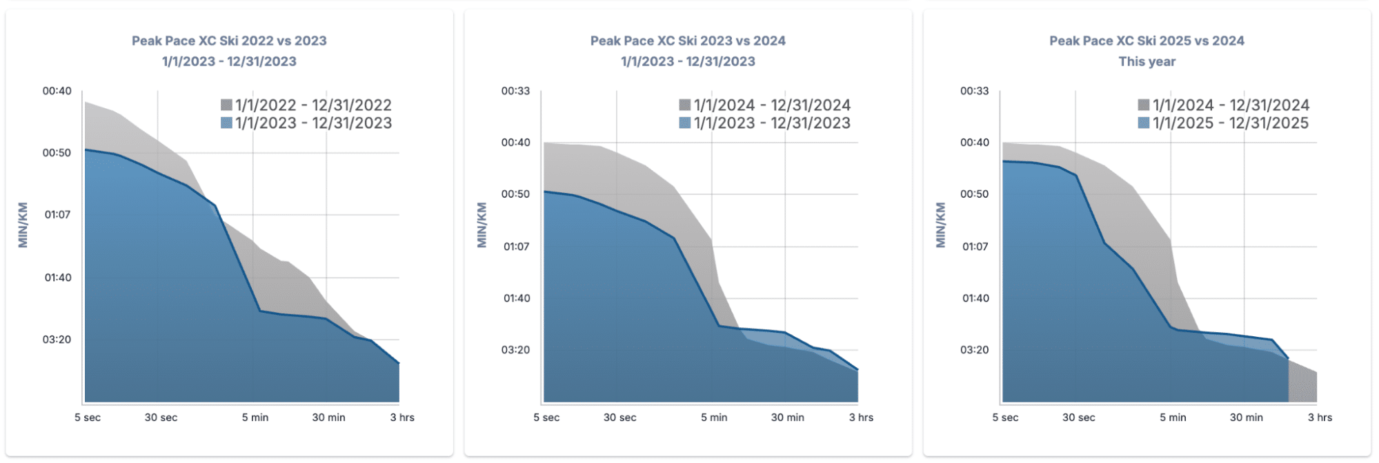
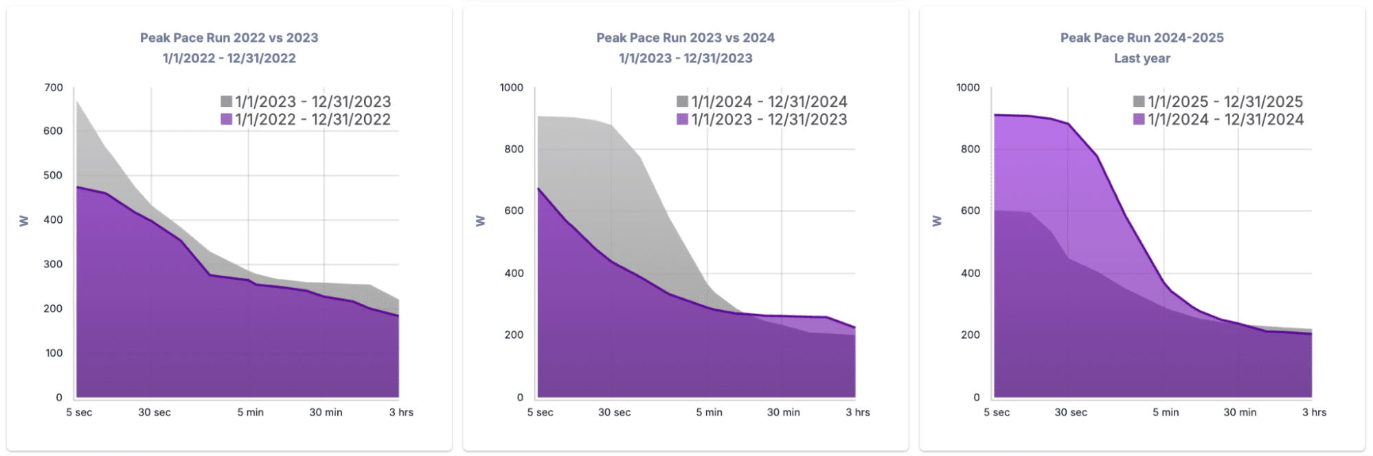
C. Compare Power Duration Curves
- Use the Power or Pace Duration Chart in your Dashboard to:
- Compare year-over-year development in power over multiple different time points
- Analyze shifts in performance (e.g. improving sprint power or aerobic endurance).
- Visualize a curve shift (leftward/upward = speed, rightward = endurance).
- If your athlete is racing in a particular distance, or if that is changing over the years, you may want to see a progression in one or the other direction
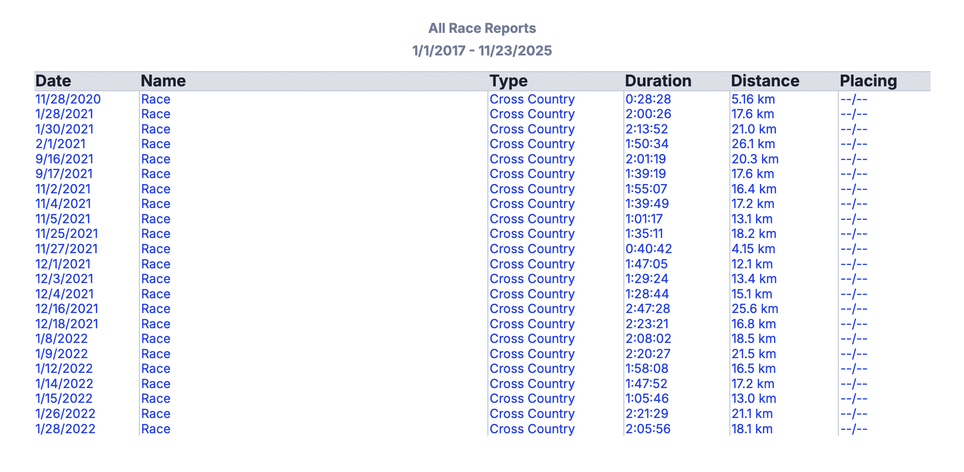
D. Populate the Race Report Feature
- Encourage athletes to organize race data:
- Create an “Event” on the day of a race.
- Pull the workout into the Event so it attaches properly.
- Add notes (placement, goals, etc.)
- This enables you to review and track performance trends across seasons.
- From the screen shot below, this athlete has been tracking races but not placings, so without the placings it is harder to visualize how this athlete is doing
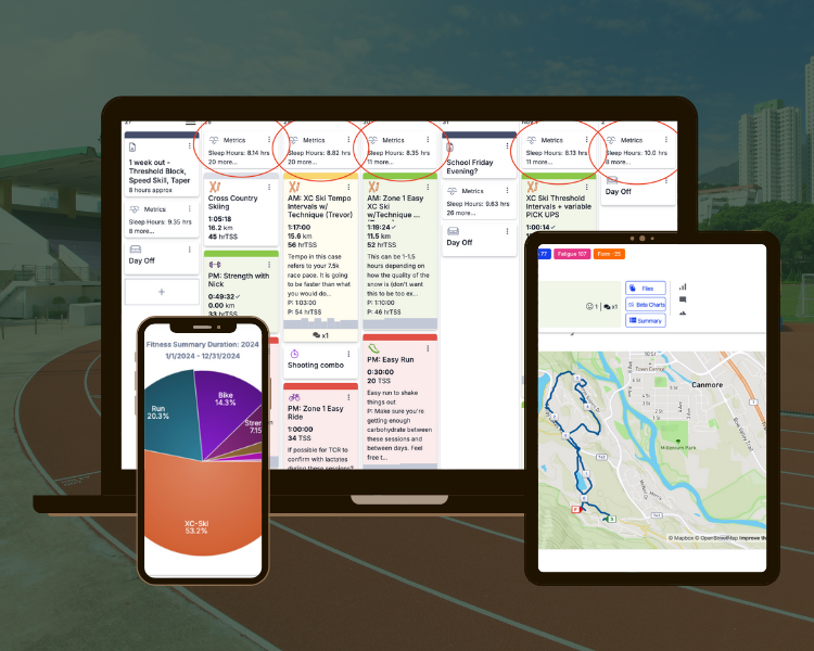
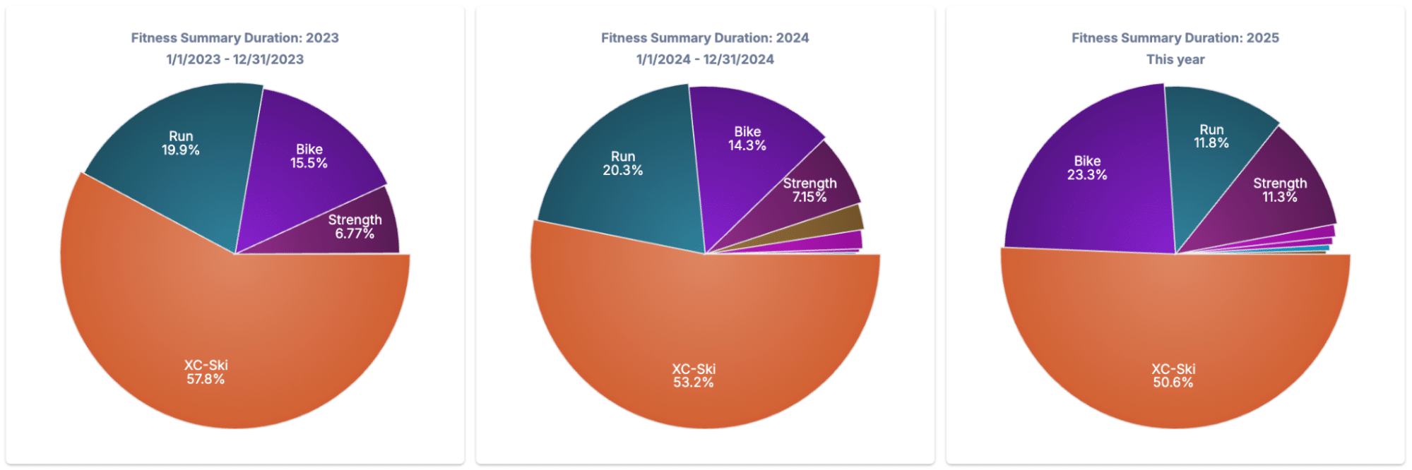
E. Year-to-Year Sport Volume Breakdown
- Use pie charts to visualize how training time is split by sport across different years.
- Great for:
- Triathletes adjusting bike/run/swim ratios.
- Skiers focusing on off-season volume distribution.
BONUS SECTION: Monitoring Tools Outside the Dashboard
These additional strategies aren’t built directly into the dashboard but are powerful tools for deeper insight:
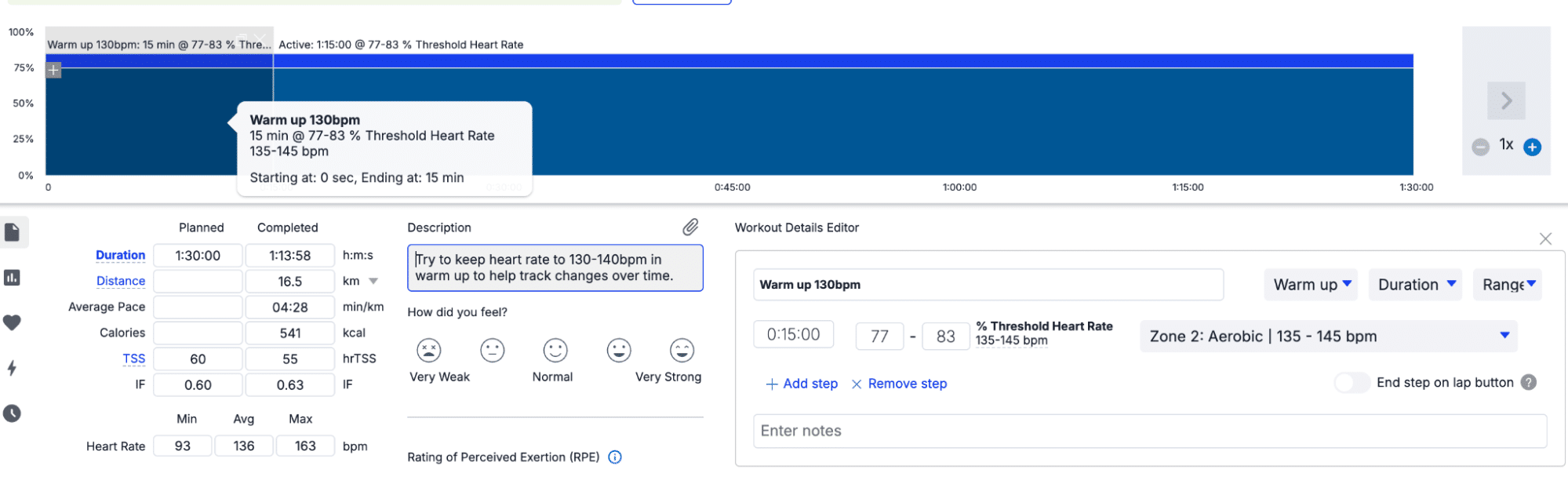
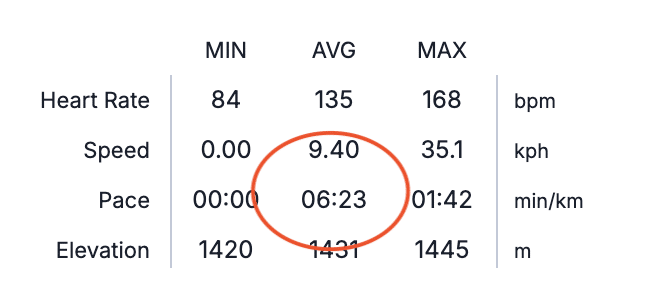
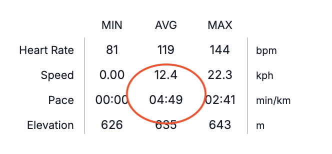
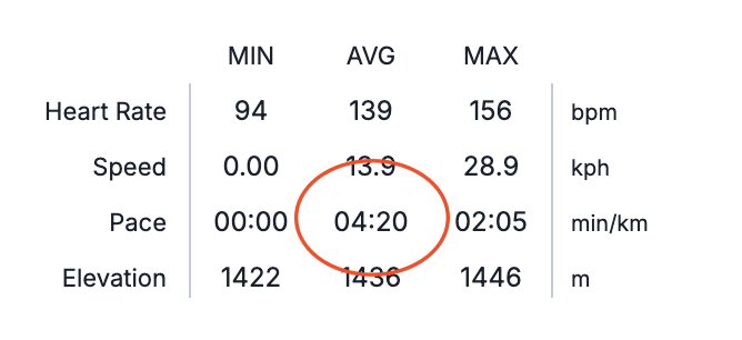
A. Standardized Warm-Ups for HR Monitoring
- Ask athletes to wear a chest strap HR monitor.
- Assign a fixed power or pace during warm-up (e.g. 10 min Z1 spin or 10-min run @ 6:00/km).
- Analyze if HR response is flattening or decreasing over time.
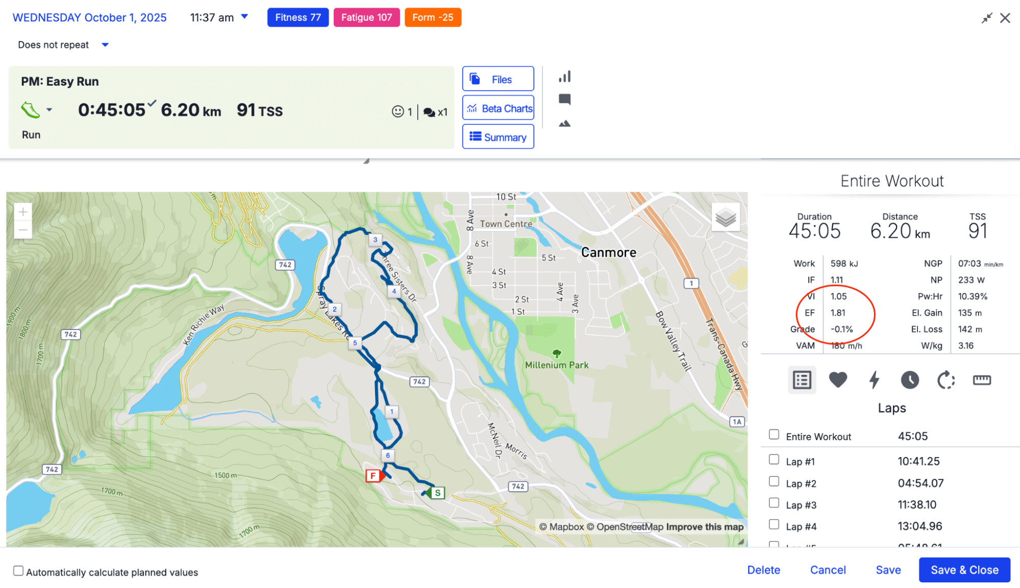
B. Efficiency Factor (EF)
- Track EF (Power/HR or Pace/HR) for comparable aerobic workouts.
- Consistent improvement over weeks = improving aerobic efficiency.
- Compare long aerobic efforts to one another (ie. 2 hours in Zone 2)
- If your EF improves, your EF number will increase. An increase in EF means that your output (power or pace) for the same input (heart rate) increases. In other words, you’re going faster for the same input.
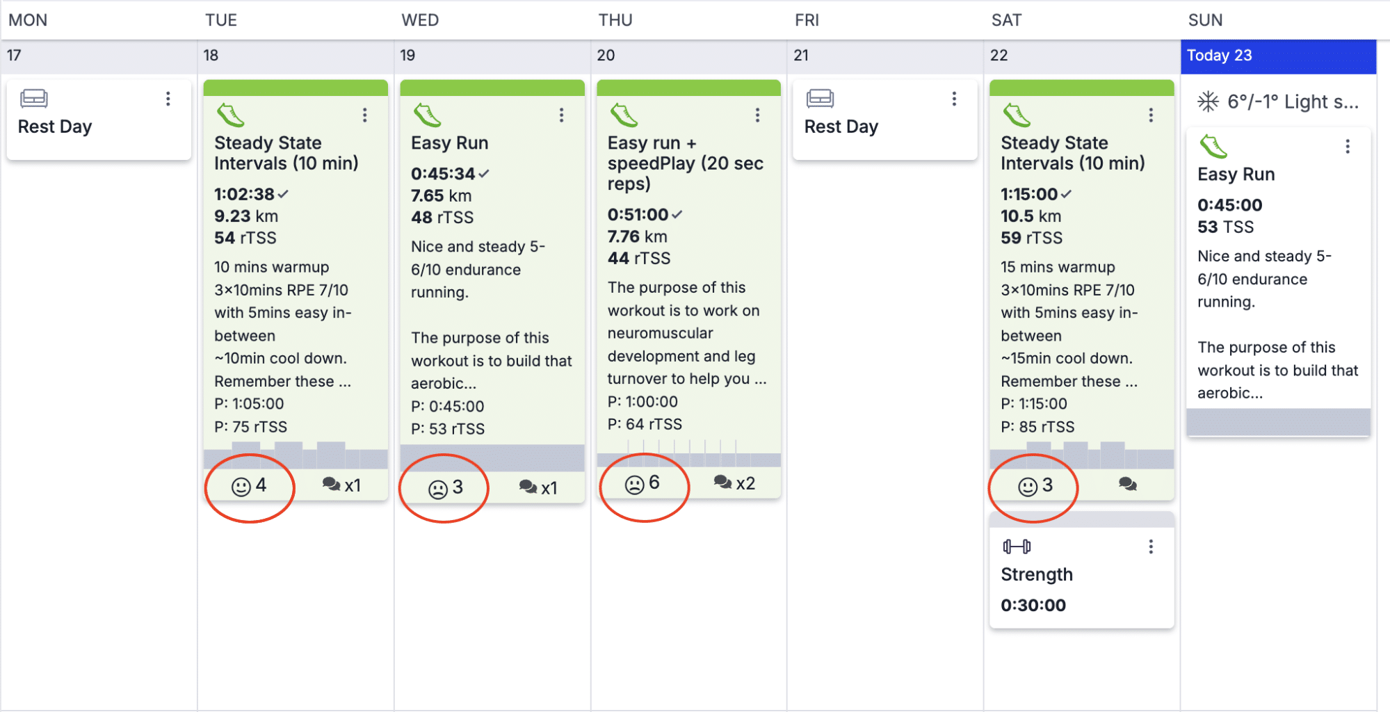
C. Athlete Feedback via Smiley Faces
- Encourage athletes to rate sessions with smiley faces.
- Quick-glance way to catch mood and perceived effort trends across a week.
- This is a great way to get an overview of how the week went in terms of the rate of perceived exertion (RPE) went (how hard they feel like they worked) but also if they feel like they are tolerating the work well
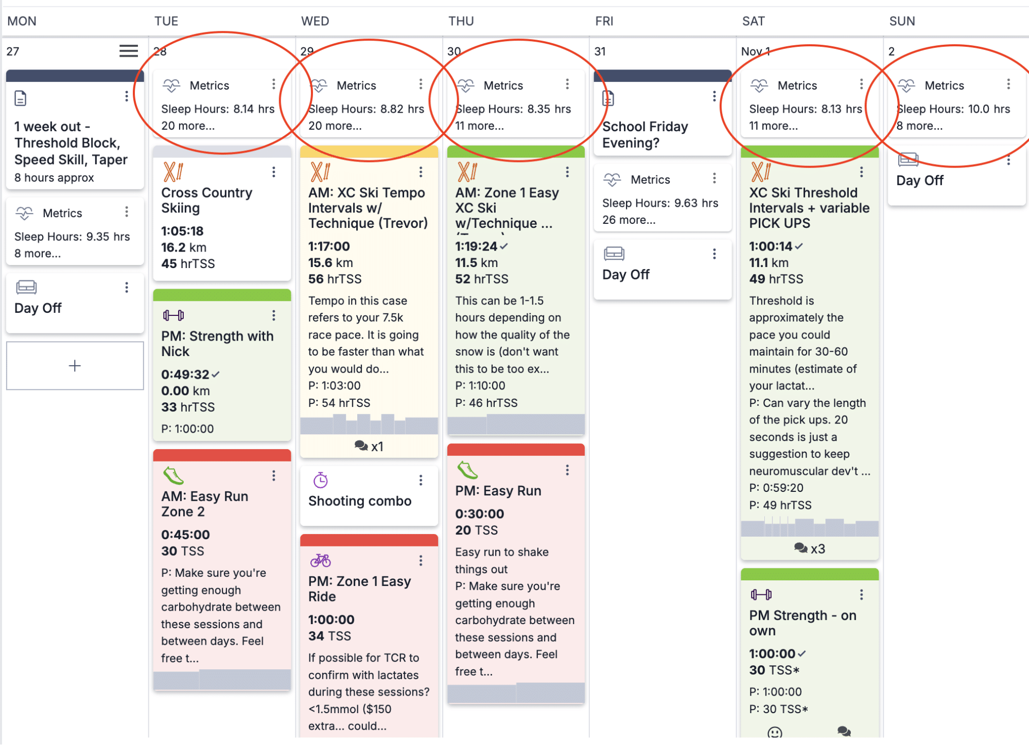
D. Track Sleep, HRV, and Body Battery (Garmin)
- If using Garmin, TrainingPeaks will import metrics like:
- HRV
- Sleep duration
- Body battery
- Be cautious interpreting these – context from athlete comments is essential.
- Use these metrics in conjunction with performance data and subjective reports.
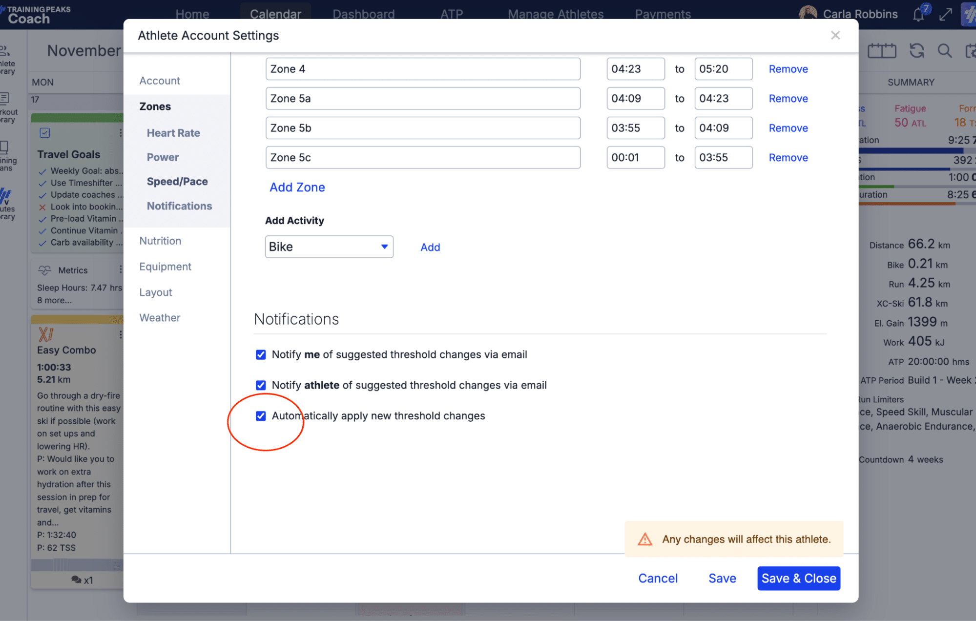
E. Automatically Apply Training Zones
- You can set TrainingPeaks to auto-update training zones when new threshold data is detected.
- Pro: Less manual admin, saves time.
- Con: Athletes might not always test in ideal conditions; verify before applying.
Want More Training Insights? If you found this helpful, subscribe to my newsletter The Physiology Toolkit. You’ll get user-friendly strength, rehab, and training breakdowns tailored for coaches, athletes, and fitness enthusiasts who want science-backed advice without the fluff.
Or, join us at The Conditioning Workshop to get a deep dive into how to better coach and fix running, cycling, or skating gait, program conditioning for any sport, take your athletes through rehab progressions related to common conditioning related injuries, and overall… take your athletes to the next level by becoming a better coach.
Conclusion
TrainingPeaks offers an incredible range of tools for tracking, evaluating, and optimizing your athletes’ progress. A smart dashboard setup lets you act fast, coach better, and save mental energy for what matters most: your athletes.
Use this guide to rework your dashboard, try out some of the bonus tools, and don’t hesitate to experiment with chart types and date ranges. Data is only as good as how it informs your decisions – and with the right dashboard, your decisions just got a lot easier.

More About The Author
Carla Robbins, Co-Founder of Vital Performance Care
Carla’s journey into the world of endurance training, strength and conditioning, and exercise physiology began with her Undergraduate Degree in Exercise Physiology at the University of Calgary and continued into her graduation with a Master’s in Exercise Physiology in 2016. Between working for the Canadian Sports Institute to the creation of her company Vital Strength and Physiology Inc (now Vital Performance Care), Carla is driven by a desire to find better ways to address complex cases in professional and everyday athletes and individuals.
Quick Navigation
- Introduction
- Track Training Load with CTL, TSS, TSB
- Longest Session by Sport Type
- Compare Power Duration Curves
- Populate the Race Report Feature
- Year-to-Year Sport Volume Breakdown
- Standardized Warm-Ups for HR Monitoring
- Efficiency Factor (EF)
- Athlete Feedback via Smiley Faces
- Track, Sleep, HRV, and Body Battery (Garmin)
- Automatically Apply Training Zones
- Conclusion
- Author Bio